My product decision
Product: Perfume with chocolate flavor
Marginal or minority target audience: For everyone, but especially kids.
Ideas for a name :
I have decided to pick the perfume with chocolate flavor because
.png)


Name ideas
- Dynamic Fusion
- Sweet Whispers
- Sugared Sprinkles
These are the names, one I like the best is Sweet Whispers.
.png)
Ideas for logo

This is too pixelated and it won't look good.


I chose this logo for my product. I made it in Photoshop with shapes and colors and I also used mask. I chose this because it's simple and cute.

Packaging sketch
.png)
.png)
This is my box for my product. I added my logo to the symbols, and then with the rectangle tool I created the desired shape and the material. The material is cardboard and it is a lighter color. For the box to be 3D, I added a 3D effect.
For the perfume bottle, I used the pen tool and applied the same 3d effect thing.

Final Package
Evaluation
This is my final product. It's a box for my chocolate perfume. I created this box in Adobe Illustrator. The first time I used the rectangle tool to create the desired shape for my box, I also added a light color. After I made the square, I used 3D and materials and that's how the packaging came out for my product. I chose it to be cardboard. To put the logo on the box, I converted it into a symbol and then went to graphics and added my logo.
And then I added the type I wanted for the name. I also added the chocolate glaze to be in the same context as my chocolate perfume. And to give it a more beautiful effect, I added black lines on the edges of the box.
For the perfume bottle, I used the pen tool and gave 3D materials and revolved.
I think it turned out pretty well and I really like that I learned new skills, it was fun trying something new. The part that I liked the most was when I transformed the box into 3D.
If I were to do the same thing in the future, I would choose to make the box bigger and with more details, for example, more writing on the left side of the box some small details, and some images.

Animate practice with Adobe animate
I made this animation on Adobe Animation. I used a keyframe and timeline. I used two shapes polystar tool and oval tool. And then with the selection tool I created the animation by moving them. It was just practical and it was easy. I like the part when you create the animation, that is when you move the objects.

Analyse animated logos
This is a bicycle animation.
The bike and the writing both appear once and then disappear.
This shows that it is for bicycles and bicycle codes and also they show that it goes fast.
We can see that the colors blue, green, white pink, and yellow are used and the background is black.
The type is normal and simple and you can easily see what it says.
Yes, it's very clear what this logo is for, it's for bikes.
It is interesting but it would improve more details on the bike.
The animation lasts about 3 seconds.
I like the way the bike moves and the colors behind it.
This is how it starts.

That's about halfway
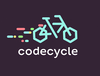
This is how it ends.

This animation is for Fanta flavored drink.
It's to promote the drink.
Blue, black, green, orange, and white are used and the background is orange.
The type is interesting and you can see that it's easy to read it.
It takes approximately 2 seconds.
The thing I like the most is the first part at the beginning when the big name Fanta appears.
I like it as it is, but if there was something to improve I would make it last a little longer because it is too short.
This is how it starts.

This is how it ends.

This animation is for the master card.
It starts with the two big red and orange dots and the master card name, and then it turns into a taco and the taco turns into luggage, and the luggage in the photo camera, and the photo into the map.
There were used images with taco, camera, and map.
Yes, it is clear what the logo is for and it is for master card and travel.
It is very interesting because it has many transitions.
Approximately 7 seconds.
The thing I like the most is the part with the transitions where it turns into the taco and then into the camera.
If there was something to improve, it would be to add something written between the transitions.
This is how it starts.

This is about halfway.

This is how it ends.

Animate my logo
For this, I tried to practice animation on the logo I created. I used a key-frame and added classic tween. I tried to add a trace bitmap but I only left motion tween. I added my logo and converted it into a symbol. The part I liked was when I added classic tween and created the animation. I like the new skills that I learned and I saw that there are many things to edit there, and in the future, I will try them all and create a complex animated logo.


No comments:
Post a Comment