Annette
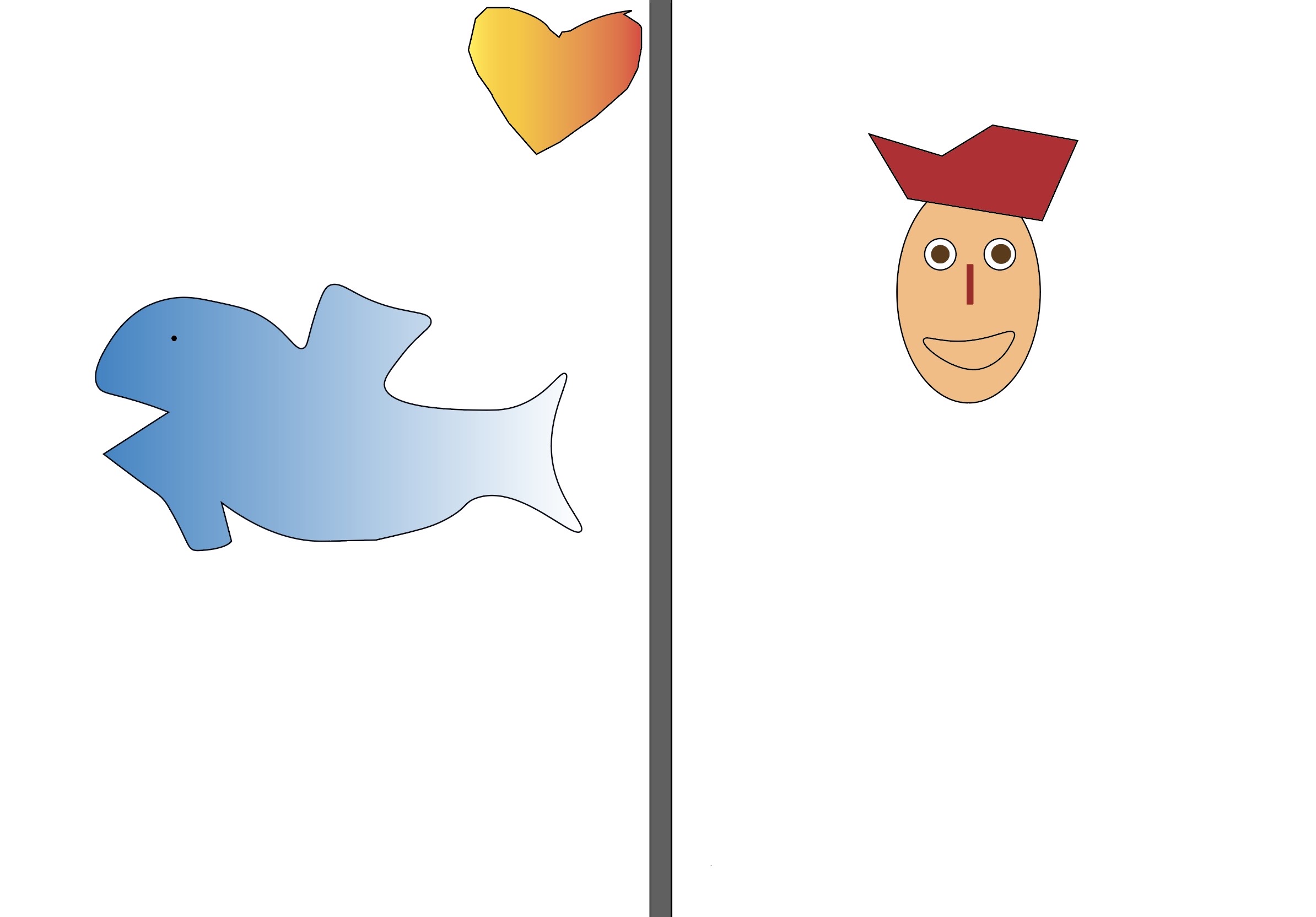
Illustrator Practice
I did this on Adobe Illustrator. I used the pen tool, made a face, and tried some shapes. After, I filled in with colours. I have a gradient. It wasn't very difficult, and I like how it turned out in practice. Next time I will do much better with more practice.
Researching patterns in currency passports


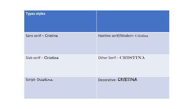
Type Styles
Passport Cover
I did this on Adobe Illustrator. I used the rectangle tool and added color. I used a text and made it the way I wanted with the pen tool. To make the pattern on the cover, I used the polygon tool, flare tool, and star tool to create the shapes in a circle. I liked it when I made the patterns, it was easy.

Passport Pattern
For this, I used the pen tool to make many lines, and I used two paler colors. And then I played with the twirl tool and wrinkle tool to make patterns. I feel like I should have added more curls, but I like it that way.

Irish Pattern
This is an Irish pattern. I used a picture with a rose and musical notes. And on top of them I made lines with the pen tool and used pale blue, green and pink colours. And then I used the twirl tool and made a model. The Irish passport pattern is more interesting and catches the eye more with the models. I like how my second attempt turned out, it's pretty good I think.

InDesign - Passport
I created an A5 portrait document on InDesign to make my passport inside. I fixed everything with the Transform tool. Then I created two more pages for the inside of the passport. I imported my passport cover and on the other two pages, I put my Irish pattern. I put my information and added a picture of me. And for page 2 I used the ellipse tool and added the writing inside. It wasn't a hard part, it was pretty easy watching the tutorial. I really enjoyed doing this.


Back cover
For the back, I added a new page. I selected the rectangle tool and added a color, then I searched for a picture of an airplane on Google and I used the rectangle frame tool and fit in properly. I used the pen tool and wrote a text. It was easy and I like how it turned out.

Evaluation
This is my final product. This is the first page of a passport, inside the passport, and the back of the passport. You can see that the first page has a pattern on it and a gradient color. Inside is my information, plus my picture, and on the left another design. To create the patterns inside the passport I used Adobe InDesign and I used the pen tool and some pale colours. An Irish passport influenced me to make this type of passport. On the back of the passport, I added two planes to give the impression of traveling and I used the pen tool to make that curved line and added text.
First I wanted to make a simple pattern, but I researched other passport designs and made another pattern, and underneath I added some musical notes and a rose because it looks so much better. Something that went well was the patterns inside my passport. I completed everything in this type of passport. I think it's a good standard, because of the appearance, and it communicates my ideas well because you can clearly see that the idea was to create a passport.
The part I didn't like so much is the back of the passport and I think it's not so complete because the color on the front page of the passport is different from the back of it. If I were to repeat this process again I would put other paler colors on the front and back of the passport and make the patterns more complete, and add more details on the back to make it look better and more real.
Evaluation for magazine
This is my final type of magazine model. I did this on Adobe InDesign, I used 2 pages and I used columns. I put a big title with a different type and for that writing, I used "replace with text".
This idea I got from Google from an example. I was looking for a picture that was exactly the same as the context of the title. I also added a subheading of my own. Something I like is the way it looks and the way it's placed, it was easy to do. If I were to do this again in the future, I would add more details because when people see this magazine they will want to read it because it attracts the eye.
Magazine
This is my magazine. I used InDesign, I added two pages and added a bigger title. And then I used the text tool and I used "filling with placeholder text". And I added a picture with the same context as my title. What I did was easy and I learned something important, how to make a magazine. I think it turned out well.
.png)
Label the magazine
I like this magazine spread because it attracts you a lot with those pink colors. And I like the way the title is written. And I label this on PowerPoint.

Joella


Portrait Photography


Genre


Types of Photography


Shot and sized camera Angles


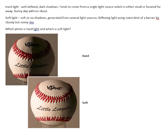
George Hurrell


02/10/23


Natural History Museum
I took some pictures of what interested me the most and what was very impressive. I liked how they were put on and how they looked. I liked the dinosaurs and the birds the most. They look very realistic and I am impressed by how big they are. I also liked the architecture of the building inside and outside. It was the most beautiful trip, and the best museum so far.
.png)
.png)
.png)
.png)
.png)
.png)
.png)
.png)
.png)
.png)
.png)
.png)
.png)
.png)
.png)
.png)
.png)
.png)
.png)
Trailers Video
https://youtu.be/K123PKkSMl4
Holiday Video
https://youtu.be/4MRHtkFrpuw
In the holiday video, I added four places that I want to go. I added transitions, my name, and credit. And I added a song that I like. I really like how it turned out.
Evaluation
This is my holiday video. In this video, I used 4 places I would like to go. I took these videos from YouTube, copied the link and to download them to my computer I used mp4 convert on google.
I used Adobe Premier Pro. I inserted the 4 videos there and started editing. I cut them however I wanted and started cutting them with that blade for transitions and effects.
After editing the way I wanted, I added music and started adding transitions. I used page peal, dissolve, and more. And at the end, I added credit and when each video started I added their names. The part I liked the most was when I cut and added the transitions.
If I had to do this again in the future, I would add another song and be more careful how I would cut and the transitions would be smoother.
Yasmin
Portrait Practice
We practiced and tried several portraits in different positions. The first picture was taken with the true reaction and shows exactly the personality of the person in the picture. The light is okay in the first picture, but in the others, the light is too bright and the exposure is too high. But it's good, I like how they came out on the first try. There were 4 lights, 2 in the front and 2 in the back. I left only the front ones on.


Fashion Photography Presentation
Cristina - Leet


No comments:
Post a Comment